It's time for another before and after! I am so giddy to share the reveal on this project! This is the sweetest little property. It was in desperate need of a lively reno with functionality at the forefront of our design plans. Let's start by looking at a before of the kitchen...
BEFORE
Where do we start? That peninsula blocking the doorway and the dishwasher crammed in the corner? Did you notice the two different windows? I live for symmetry so you can imagine that was a big "no-no" for me. What pains me the most is our clients actually LOVE to cook. Like they have all the fancy pots, pans, and gadgets and gizmos of plenty. Renovating a kitchen for someone who cooks is always such a treat. You know they will appreciate the process, making selections and obviously the final space will be thoroughly enjoyed.

You can see in this photo how isolated the kitchen feels from the rest of the space. It's also very choppy and the appliance placement is driving me crazy. Good luck opening that left fridge door on the daily. This kitchen is low on functionality and efficiency. Oh, but how much more fun does that make the reno?! SO much more fun!
The living room and dining room in this home are approx. 440 sq ft. so we definitely needed to maximize the space. We also had the challenge of some existing windows and doorways/walkways. Our first step in any renovation that will require heavy demo is a contractor measure day for rough labor costs and then we follow that up with floor planning. Let's look at our floor plan below.
FLOOR PLAN

Our clients knew they couldn't fit a dining table AND an island with seating so they opted for a larger island that would seat 5 and really be the heart of the home. We relocated a couple windows and came up with the 3D concept below.
3D CONCEPT

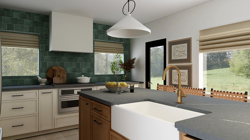
Ok, is it not so darling and inviting? I am OBSESSED with the green tile! It's always so fun to do an earthy pop of color. And it just feels so moody with walnut-stained rift oak and the concrete finish countertops. Don't ya think? Let's see how that 3D evolved and came to life below in our final photo shoot!
AFTER

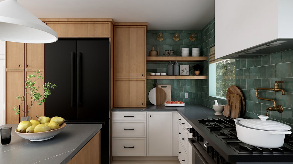
We opted for a 36" GE Cafe range and refrigerator in their matte black finish which is just so bold and I love it so much. It's fun to get creative with the appliances since we see so much stainless steel. And the brass hardware on them is darling too!
Let's look at another 3D concept we provided at presentation.
3D CONCEPT

You can see how we relocated the fridge and built an appliance garage to the left for lots and lots of coffee. I also loved working in some floating shelves for some of their everyday plates and bowls. And well, I just love open shelves. It's a great opportunity to soften a hard space like a kitchen with some softer decorative items. Ready for the styled after?
AFTER

That range though. Love. Love. Love. I mean this corner just gives me allll the feels. The vintage runner, the tile, the lighting, the warmth from the wood...I want it all. Before I wrap up, it wouldn't be fair if we didn't talk about Jameson, the cutest dog ever! And of course his feeding station complete with motion sensored lighting for those late night snacks.
Photo Credit: MinoProMedia.com
Isn't he the cutest? He is my favorite accessory in the kitchen. Another quick note you may not have noticed, we installed tile floors throughout. Our clients want to keep this property as a possible long-term rental which means durability was top priority. Tile is always best when it comes to durability, but it can make a space feel cold and uninviting. I love how all the warm elements really counteract the floor tile to make the space feel comfortable and welcoming.
Photo Credit: MinoProMedia.com
I don't think I knew how much I loved a green kitchen until this beauty. This space is a great reminder that lost of natural sunlight and darker-warmer colors don't always make a space feel cramped or small. We did paint the walls Sherwin Williams 7008, Alabaster. Hands down one of my most favorite shades of white. It's a tiny bit creamy and really warms up and brightens a space! I'll make sure to also reveal the remainder of the space which includes a custom record bar on our next blog post, stay tuned!
Ready to renovate with The True House? Head to our services page to book a complimentary discovery call or email us at hello@thetruehouse.com for more details about working with us!


Comments