I am obsessed with this transformation! This is what I would call a FULL. GUT. RENO. We took down a wall, relocated appliances, etc. VS. what we call a "remove and replace". That just means gas lines are staying, we aren't relocating windows or tearing down walls, etc.
I want to share a little into our design process for this kitchen. Here is the before...
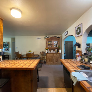
BEFORE:
Let's all say it together...DATED! This kitchen needed a major overhaul. Don't even get me started on the fridge next to the range. That's a big no-no! This mama deserved a major upgrade. Wanna see our original concept? I think it helps to have dimensions for some of you that may be tackling a kitchen renovation without a designer.
When we floor plan we always think about adjacent spaces. We want the best flow throughout the shared areas. So we decided to remove the living room/TV wall and relocate the TV so we could have that overall flow. We wanted to keep the sink in place to avoid any additional plumbing labor. And then we wanted to anchor the space with a large island and have a large pantry space for maximum organization! Take a look at our 3D concept!
3D CONCEPT:
Isn't it pretty? We loved the idea of a dark walnut island and an "X" detail to tie in that farmhouse style our client loved. We blew out the wall on the right and made the island the focal point. After all, we all know that's where everyone gathers.
PLOT TWIST:
So we presented our concept to our client and she loved the layout and overall aesthetic, but really loved a black and white color story. I don't blame her, it's so classic! So we listened and rendered a secondary option in black and white...
I really love both concepts so much and am glad our client was able to communicate her personal aesthetic and we ended up embracing the black and white for a beautiful after! See below...
AFTER:
What do you think? So we actually closed up the arch above the sink, we needed the cabinet storage since we lost the other wall. Then we said goodbye to the eat-in kitchen to build in refrigeration, bar and pantry. Sometimes people forget when you execute an open concept you are losing a lot of wall space and you need that wall space for wall cabinets and appliances, obviously. We opted for floating shelves above the sink to still have a lovely sink moment.
Isn't is darling? So inviting and way better than staring at a wall while you do the world's worst house chore.
This kitchen really is a dream! We did a panel ready beverage fridge and a wonderful coffee station. And the cutest wall sconces. And styling is always my favorite, so you'll see lots of details and FOOD of course, the essentials!
Wanna see more of this kitchen? Head to the project page HERE. Ready to start your renovation? Let's chat! Schedule a Complimentary Discovery Call and let's get started!
Joyfully,
Alyce @thetruehouse


Comments